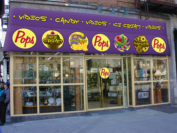
A previous client of ours was thinking of opening a store in midtown Manhattan. A store that focused on four distinct offerings. We were asked to bring his vision to life!
We knew from the beginning this would be a challenging project. The creative brief from the client included some challenging concepts: highlight each offering (4) equally, make it fun and appealing to children and adults, make it a very unique brand with a equally unique storefront, and it had to be called “Pops”. A fun and unique “Pops video, ice cream, donut, and candy store” for all ages? Really? Yes.
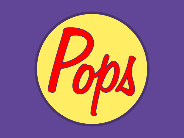
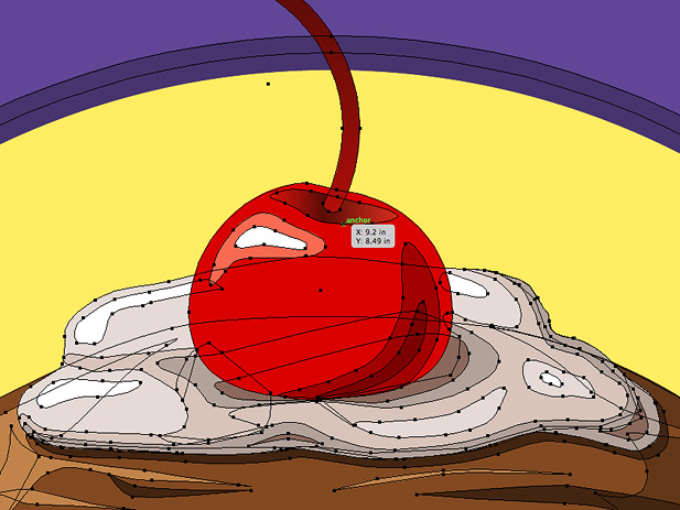
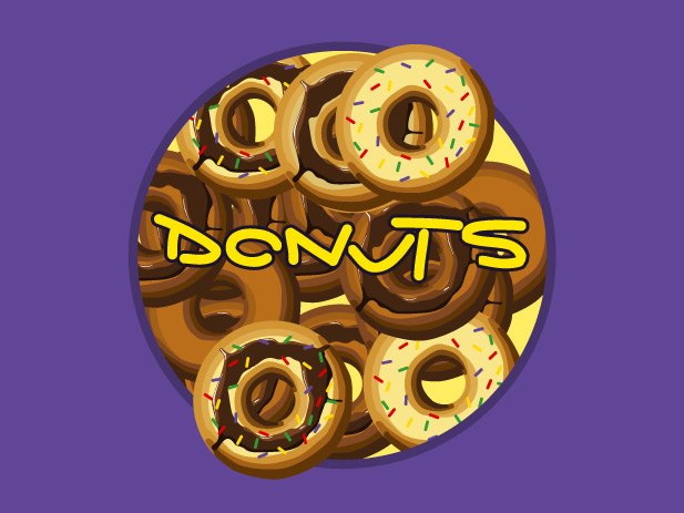
We started with a comic book concept, almost a Lichenstein type of feel. We used bold color, and a whimsical typeface. Although we went through a few iterations, the client liked the direction we were moving. The first was the logo, which would guide the rest of the brand going forward. Once we had preliminary approval, we started to flush out the rest of the illustrations that would symbolize the store’s offerings.
While we were crafting the branding, we were also working to visualize the storefront itself. We went down to the proposed location, took some photos, and got a feel for the neighborhood. As we got further in the process, we started to combine the project and alter each component to fit the total vision of the storefront, making sure it worked cohesively and holistically. Although the client loved the final store mock-up, logo, and illustrations we delivered, the economy of NYC was still flat and unwelcoming to new concepts like “Pops”. It was however, a fun project!
Please click the Post Tags below to display a list of similar products or projects created by Santoriello Studios.
