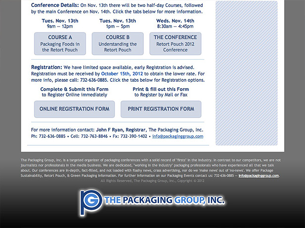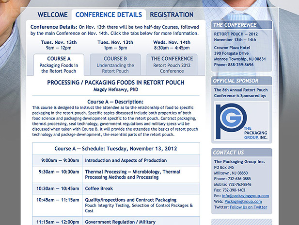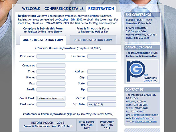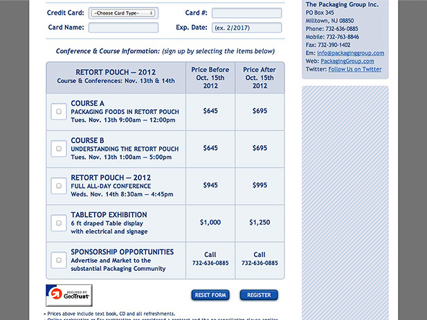
The Packaging Group turned to our studio to reinvigorate their various conferences. We improved their outdated technology, usability, branding, & messaging with a single webpage.
When the Packaging Group commissioned us for help, we set out to improve the marketing and branding of their packaging conferences with a totally new approach, based on a new strategy of investing in the professionalism of the brand. We felt strongly that potential consumers purchasing their conference registration online, will only do so if they sense the brand has credibility and looks hyper-professional. To that end, we recreated and updated their existing logo with new coloring and typeface, creating a vector illustration that is resolution independent. We also accompanied that logo upgrade with a new custom-made branding graphic, a reusable illustration, improving the overall brand as well. We also implemented new technologies like modern Javascript libraries & CSS which improved usability and creates a fluid, slick user experience. And finally, we improved the copy and text across the board, making the site more straight forward, easier to navigate, and digest the complexity of the information. All of these individual tasks were done to support the investment to the hyper-professionalism of the brand – to ensure consumers were confident in parting with their hard earned money.
The Technology – The Packaging Group Website – (Link)
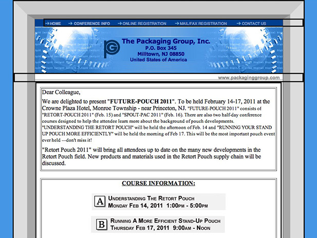
The Packaging Group’s prior website was built on basic technology, just using html. Our studio implemented modern Javascript libraries, creating custom code and development to ensure the user experience was the most professional possible. This includes making every element that is clickable, changes color on rollover. Additionally, we implemented smooth animated transitions when a user clicks on different pages or sections. We also deployed CSS (Cascading Style Sheets), which allowed us to create custom, repeatable styles to apply to the many different elements on the webpage, including text, buttons, tabs, shapes, and images.
The Design – The Packaging Group Website – (Link)
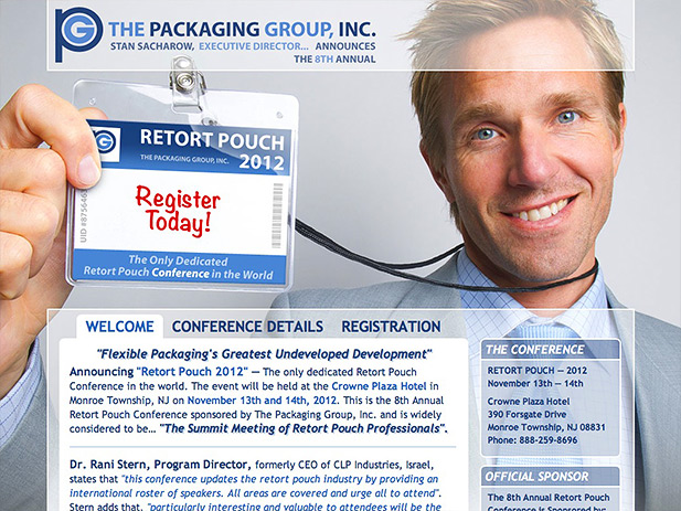
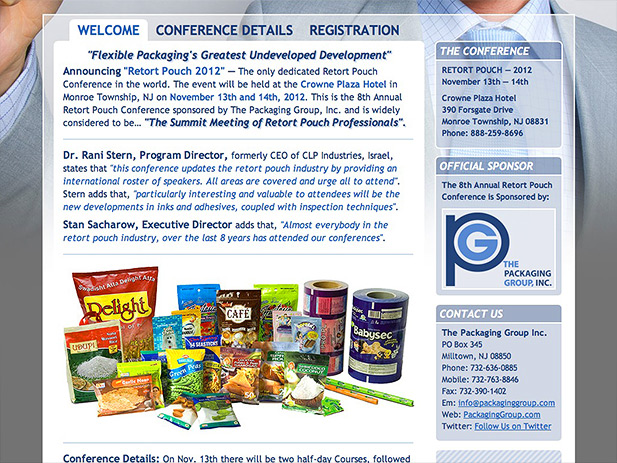
The Packaging Group primarily produces & directs conferences for the packaging industry, and we wanted their website to instantaneously communicate that graphically. We thought we found the perfect photo, not only of a happy guy holding a conference badge, but the badge was completely blank. This allowed us to design and create our own conference badge artwork, which also allowed us to use the our new branding artwork and colors. One of the best features of the photo was the colors of the man’s clothes matched perfectly with the branding colors we previously choose, with the skin tones providing a nice contrast. For the user interface and information design, we reviewed the totality of the data to present, and then simplified and streamlined the presentation and navigation. We then finalized the rest of the site’s design around the existing shapes and color palette. We think it was a marked improvement over the previous website.
Please click the Post Tags below to display a list of similar products or projects created by Santoriello Studios.
