Our Studio started by redesigning the Closet Drape logo & creating an overall brand. We designed their new identity to work seamlessly with their new Trade Show Booth, Website, & Business Cards.
Although Closet Drape has a very specific product for an easily targeted audience (College Dorm Managers), they’ve historically struggled to convey their innovative solutions to their customers. Our goal was to design and create a matching Website and Trade Show Booth that defined the product and communicated its value to their customers instantly. The first step to accomplish this goal was to create the new logo that would be the bedrock of the new designs.
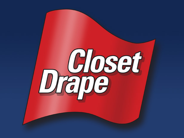
The Closet Drape Base Logo
Because Closet Drape had many ongoing customer relationships, we decided to keep the basics of the previous design, white text on a red background. We first created a new shape for the background that simulated cloth, adding subtle highlights and shadows to the red background shape along with a drop-shadow to add depth. Next, we choose a new font with custom spacing, aligning the “L” in Closet with the “P” in Drape. We then added outline and drop-shadow to make the text really pop, creating more depth. Finally, we altered the red background shape, ensuring the straight edges were the exact same angle as the tilted, italic text. Having finished the base logo, we moved on to the color palette and developing the rest of the brand.
The Closet Drape Brand Identity and Color Palette
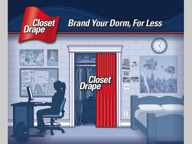
We next had to plan out how we would bring a branding commonality for the Website, Trade Show Booth, and the Business Cards. We decided they would all share a prominent, horizontal branding bar. We created a similar curved shape that we used in the logo, extending it along the length of the new horizontal branding bar. This reinforced the logo’s shape, while reinforcing the cloth-like feel of the Closet Drape product. To compliment the fire engine red, we chose a series of deep blue colors for the top and bottom branding bars and muted blue colors for the illustrations, we did this for a few reasons. First, the blue color created a familiar but striking theme of red, white, and blue. Secondly, using the deep blue and muted blue colors together, we create an overwhelmingly colorized look which makes the contrast of the red logo (and other colors) really stand out and catch your eye. We completed the branding bars by adding a small but distinct red line all the way across, unifying the color theme even more. And finally, by making the logo large enough to sit on top of the deep blue branding bar and extend on to the muted blue illustrations, we create a dramatic sense of depth, adding to the 3D perspective of the room illustrations. The finished horizontal branding bar is the foundation of all future Closet Drape advertising and branding, including their Website, Trade Show Booth, and Business Cards.
The Closet Drape Trade Show Booth
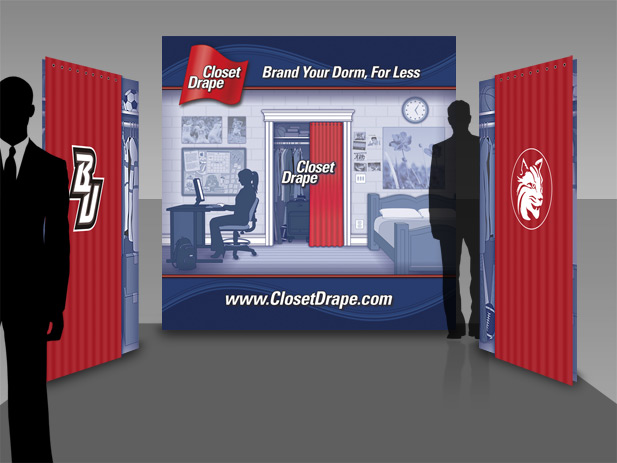
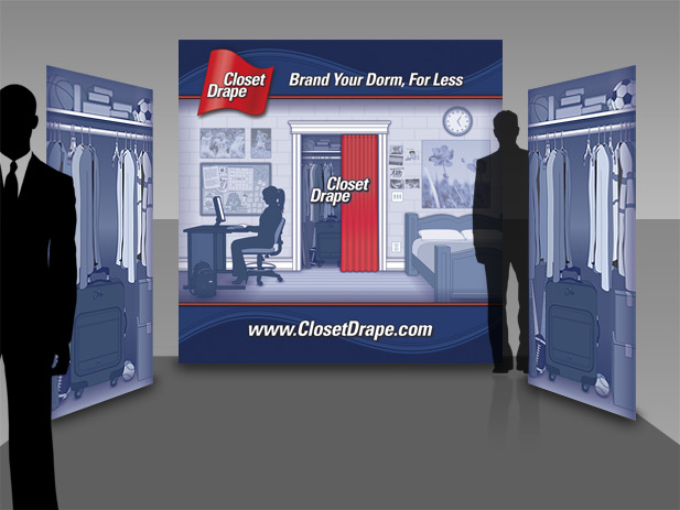
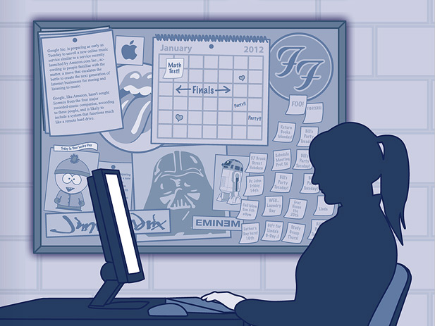
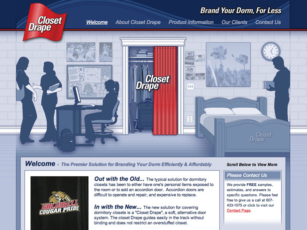
We thought the easiest way communicate the Closet Drape product, would be to illustrate a dorm room, highlighting the closet in the middle of the design with a half opened drape, revealing the closet’s contents. We would do this for the Trade Show Booth and the Website. We started with the Trade Show Booth because the illustrations would have to be larger than 8 feet tall and 9 feet wide, truly enormous. While working with “National Flag & Display” to produce the physical Trade Show Booth, they had a great idea. They suggested producing two additional stand up displays which would have a cluttered closet printed on them, and then attach actual Closet Drape products to the top, allowing customers at the Trade Show to open and close the Closet Drapes revealing the printed illustration of a clutter college closet. Brilliant ![]() We got to work making the illustrations of the closets and the dorm room. They would have the look of a architect’s blueprint, using only shades of blue. These were created using original hand-crafted illustrations along with some purchased clip art. Our client loved the Trade Show Booth : “I have struggled for years with how I thought the booth should look because I was never happy with my old one. People would look at it and not get it. Your Studio has created an incredible display that just tells them at a glance what we are all about. That is so hard to do and you did it.”
We got to work making the illustrations of the closets and the dorm room. They would have the look of a architect’s blueprint, using only shades of blue. These were created using original hand-crafted illustrations along with some purchased clip art. Our client loved the Trade Show Booth : “I have struggled for years with how I thought the booth should look because I was never happy with my old one. People would look at it and not get it. Your Studio has created an incredible display that just tells them at a glance what we are all about. That is so hard to do and you did it.”
The Closet Drape Website – (Link)
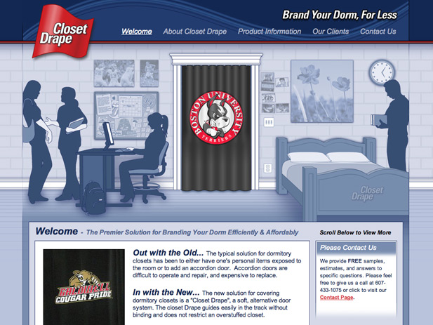
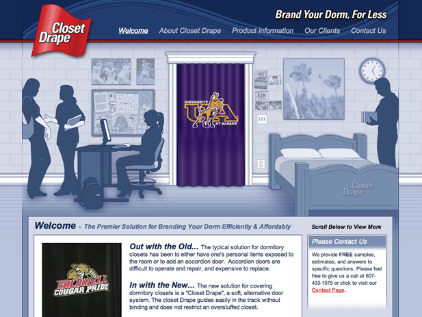
The Closet Drape Website also shares the design for the Trade Show Booth, but we also had the ability to add animation. The dramatic effect of many branded Closet Drapes animating on the screen is the main feature of the Website. The animations instantly communicate what the product is and the value to the potential customer is easily identified. Because Closet Drape is located in upstate New York, we relied on photos the client sent to us. These photos and our additional copy writing helped round out the rest of this small, but effective website.
The Closet Drape Business Card
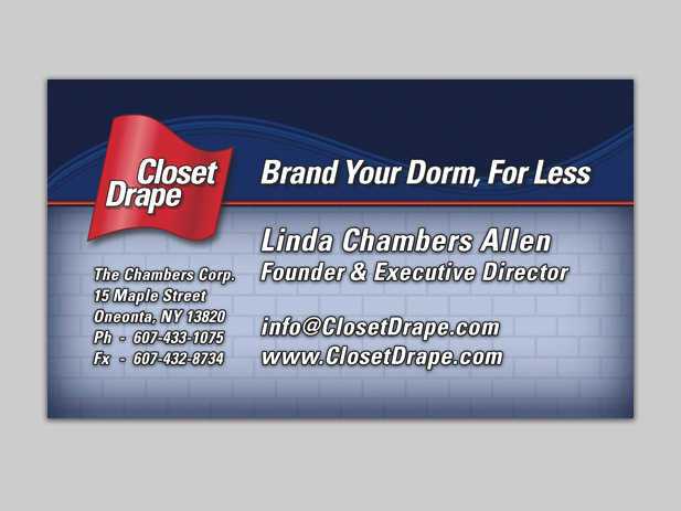
Although the Trade Show Booth and the Website have very detailed illustrations, we think the Business Cards for Closet Drape really show the beauty of the basic design for the brand. The Business Card is simplistic, but visually powerful with its color palette and mix of hard, straight lines, and biomorphic shapes.
Please click the Post Tags below to display a list of similar products or projects created by Santoriello Studios.
