We were referred to a new client who was opening a cafe in NYC. They needed a name, a logo, letterhead, business cards, menus, napkins, cups, bags, shirts, signage, and more. What a fun project!
Our client actually had an additional motivation, they had developed software for ordering food online. They believed the synergy of combining the ownership of both – the online ordering system and the actual restaurant – greatly improved the likelihood of success for each line of business, as a unit or separately. This was an interesting concept we were excited to be a part of and help become a success. Our first task was working with the client to come up with a name that would appeal to the fast paced lifestyle of New York City workers and tourists near the Empire State Building.
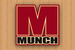
We came up with a rather large spreadsheet of names, correlated by what we thought were the demographic appeal of each name. Our first choice – ‘The Munch Box’ – had very interesting implications for the logo and packaging, most of the group loved this name. However, we worked with the client to eventually shorten the name to Munch. Shortening the name created an opportunity to design a more modern and sophisticated visual stamp, as well as being a bold, short verbal stamp – MUNCH. Our next challenge was to create and design the branding so it worked for a multitude of uses spread across every media type: print, packaging, online graphics, computer displays, TV broadcast graphics, and video imagery.
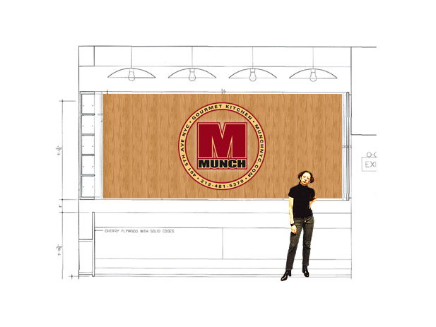
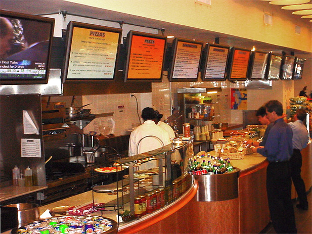
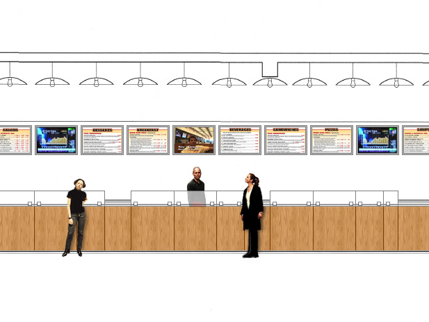
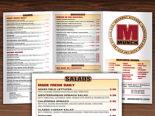
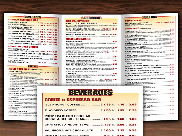
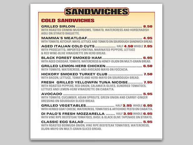
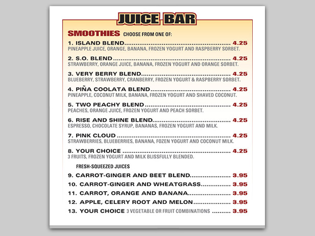
As we created several branding possibilities, we quickly augmented our designs to also include the AutoCAD schematics from the architect, helping the client to better visualize the branding at scale within the retail space. While finalizing the logo design, we started on the secondary branding elements that would comprise the store’s signage, shirts, menus, etc. Working with the client and the architect, we developed a consistent design for the menu system that would be displayed in several areas. First, the 10 plasma TVs were designed to display the menus offerings as well as daily specials. This required broadcast quality graphics. Next, the 5 large in-store menu signs were crafted to match the designs. And finally, working with the Chef, we designed the 2 different printed menu handouts – the consumer menu and the catering menu. The challenge was to ensure all the displayed menu items were consistent in color and composition.
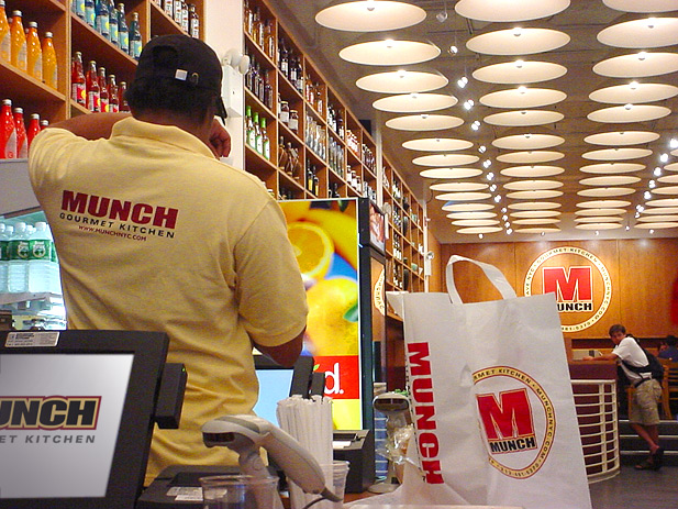
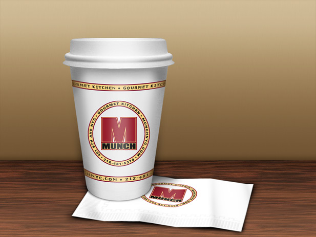
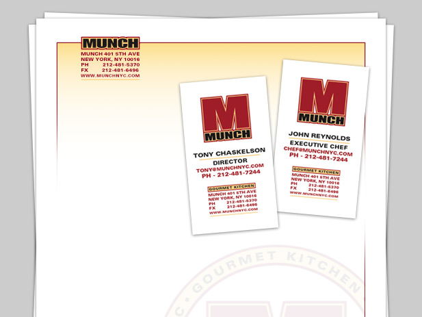
We then moved to create the remaining products based on the final branding; the cups, napkins, shirts, window graphics, letterhead, business cards, and the carry-out bags. We worked with the various printers and agencies to ensure consistency of the new MUNCH brand, and it was an exciting day when the store finally opened. We worked together with the architect and the client throughout the process to make sure MUNCH was a cohesive visual space, highlighted by the architect’s clean design using simple repetitive shapes, complimented by our bold and geometric graphics, our combined efforts created a modern, yet comforting space.
Please click the Post Tags below to display a list of similar products or projects created by Santoriello Studios.
